Designing for phones first
On most small-business sites, well over half of visitors use a phone, many of them on Android with a mid-range screen. If the page works there, it'll work everywhere.

How responsive editing works
Elementor stores separate values for desktop, tablet and mobile (and optional extra breakpoints such as laptop or widescreen, added in Site Settings → Breakpoints). Settings with a device icon next to them can differ per device; if you don't set a mobile value, it inherits from the next larger size. Switch device with the responsive bar at the top of the editor.
Containers on small screens
- Switch row containers to Direction: Column on mobile.
- Use the Order setting (or Column Reverse) to decide what comes first, usually the text.
- Reduce padding: 96 px of space on a 360 px wide screen wastes a third of the view.
- Hide elements per device sparingly. Hidden content still loads and still needs maintaining.
Type sizes
Body text of 16–18 px on phones, headings scaled down so a word doesn't break across lines. Instead of three fixed sizes, a CSS clamp() value grows smoothly with the screen; the fluid type calculator works it out for you.
Touch
Buttons and links need room for a thumb: at least 44 × 44 px with space between them. Make phone numbers and email addresses tappable links. Hover effects don't exist on touch screens, so never hide essential information behind them.
Test on real phones
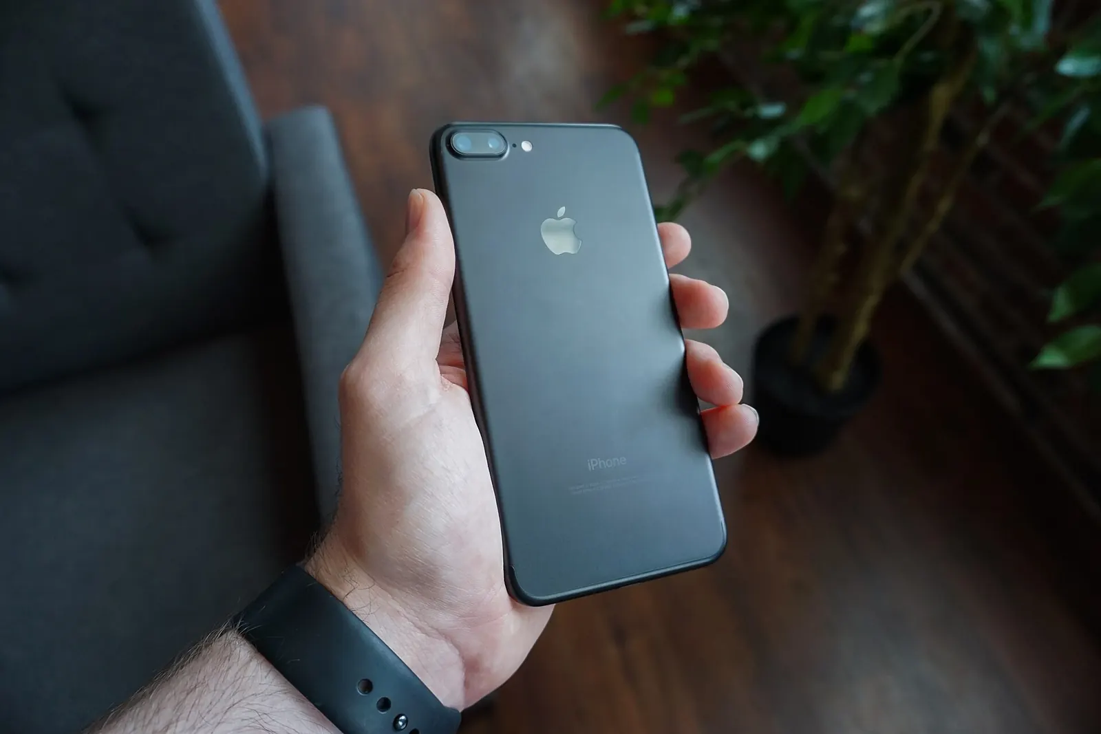
The editor preview is a narrow browser, not a phone. Check the published page on at least one Android phone and one iPhone, in Chrome and Safari. Look for:
- sideways scrolling (usually a too-wide element or negative margin);
- text overlapping images in heroes;
- sticky headers or cookie banners covering half the screen;
- forms where the keyboard hides the submit button;
- pages that take more than a few seconds on mobile data.
Speed on phones
Mid-range Android phones are much slower than laptops at running JavaScript. Turn off features you don't use (Elementor's Features settings include performance options), limit animations, use one or two font families, and compress images. Measure with PageSpeed Insights using the mobile result.