Features
Three to six short points that answer "why this?". It's the most reused block in any template kit.
Building it
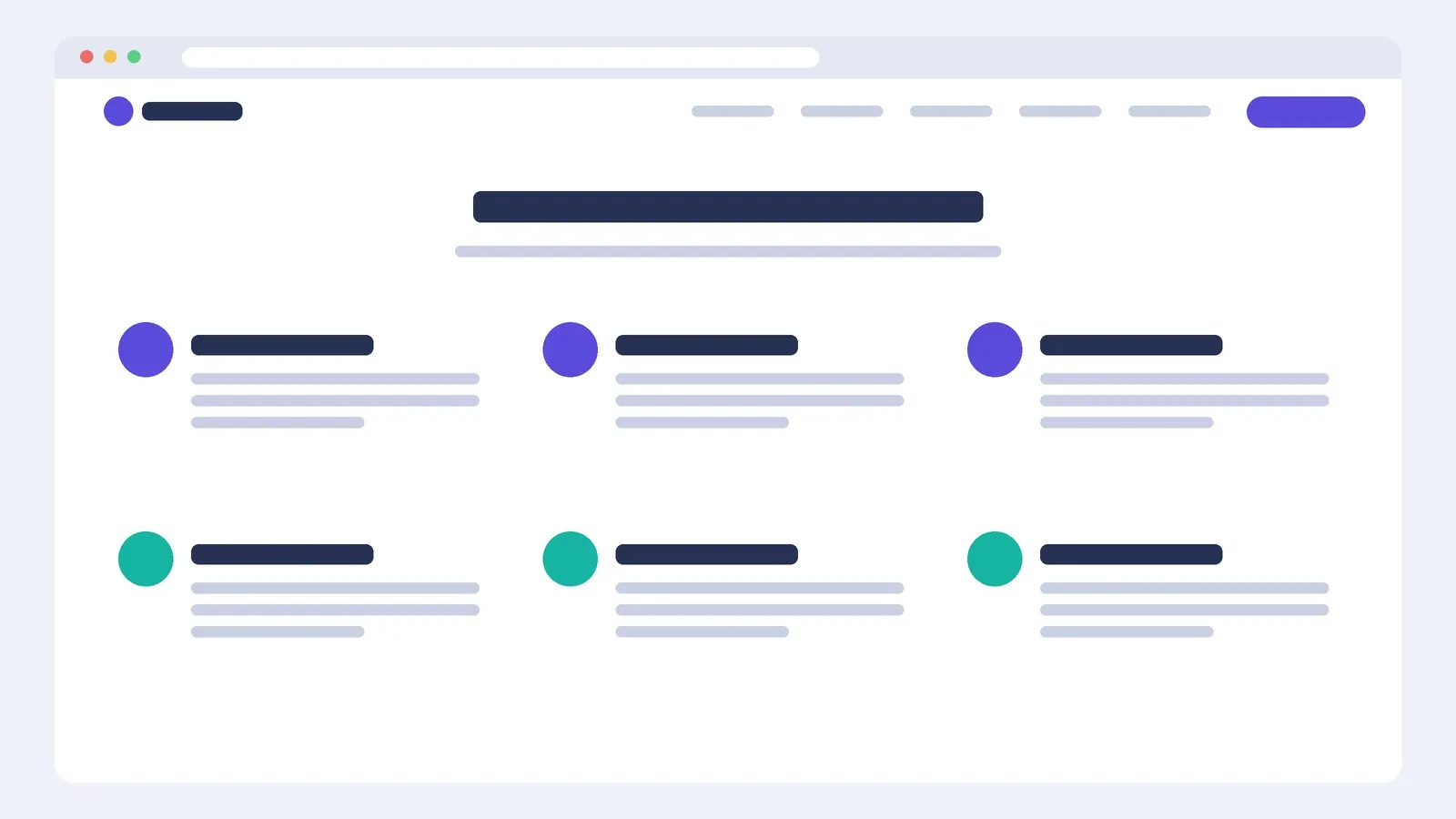
A heading and intro line on top, then a grid container (three columns, two rows) of Icon Box widgets. Set icon position to top or left; left saves vertical space on mobile.
Use one icon set throughout (Font Awesome, Elementor's own icons or uploaded SVGs) with the same style: all outline or all solid, one colour.
Benefits over features
Pair each feature with what it means for the reader. "Automatic backups" → "Automatic daily backups: if something breaks, you're back online in minutes." Keep titles to three or four words and descriptions to two lines.
Keep it even
Six items in a three-column grid looks deliberate; five leaves a hole. If you have an odd number, use a different column count, or make the last item a call to action.
Questions
Should the icons be clickable?
Only if each feature has its own page. Otherwise links on icons just lead people away or nowhere.