Home page structure
A home page has one job: to tell a visitor within seconds what you do, for whom, and what to do next. Everything else supports that.
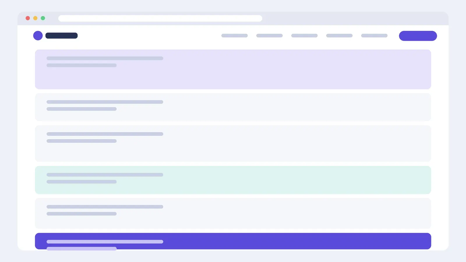
A section order that works
- Header: logo, four to six menu items, one highlighted action. See header block.
- Hero: a headline saying what you do, a line saying who it's for, one primary button. See hero image and split hero.
- Proof: client logos, a key number or a short quote, close to the top.
- What you offer: three to six services or features. See features block.
- How it works: three steps from first contact to result.
- Testimonials or a case study: see testimonials and project block.
- Call to action: repeat the main action. See call-to-action block.
- Footer: contact details, key links, legal pages.
Building it with containers
Give each section its own top-level container with Content Width: Boxed for text-heavy sections and Full Width for sections with a background colour or image that should run edge to edge (put a boxed inner container inside to keep the text aligned). Name each container in the Navigator (hero, proof, services…) so the structure stays readable.
Keep vertical padding consistent: for example 96 px top and bottom on desktop, 64 px on tablet and 48 px on mobile. Using the same values everywhere makes a page feel designed rather than assembled.
Common mistakes
- A slider in the hero with five messages instead of one clear headline.
- Three or more competing buttons above the fold.
- Generic headlines ("Welcome to our website") that could belong to anyone.
- Everything animated on scroll, which slows the page and distracts.
Questions
How long should a home page be?
As long as it needs to answer what, who for, why you, and what next. For most small businesses that's six to eight sections. Shorter is fine if each section earns its place.